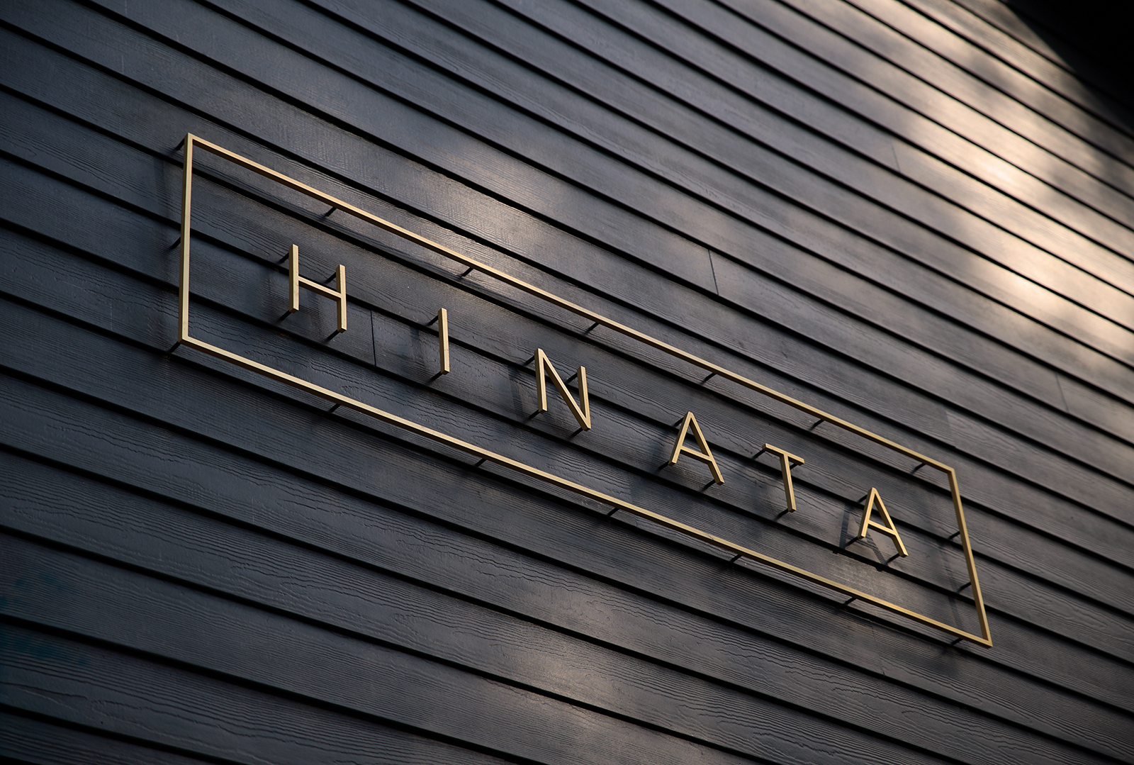
/// CASE STUDY — BRAND IDENTITY
Hinata Retreat
Year2025
ClientHospitality Client
LocationResort
RoleBrand Direction
CategoryBrand Identity
DISCIPLINES
- + Brand Identity
- + Environmental Design
- View on thomlong.com
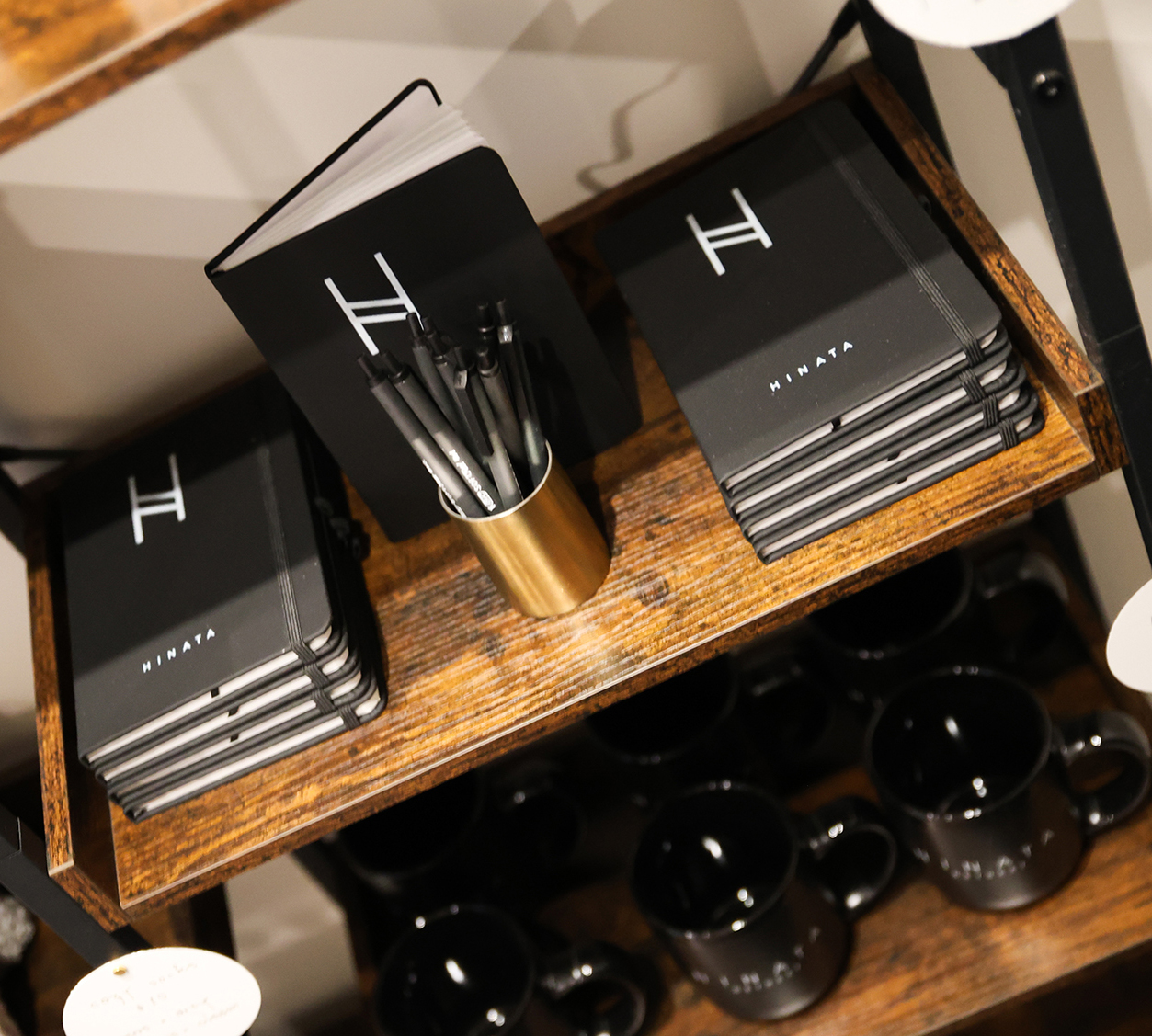
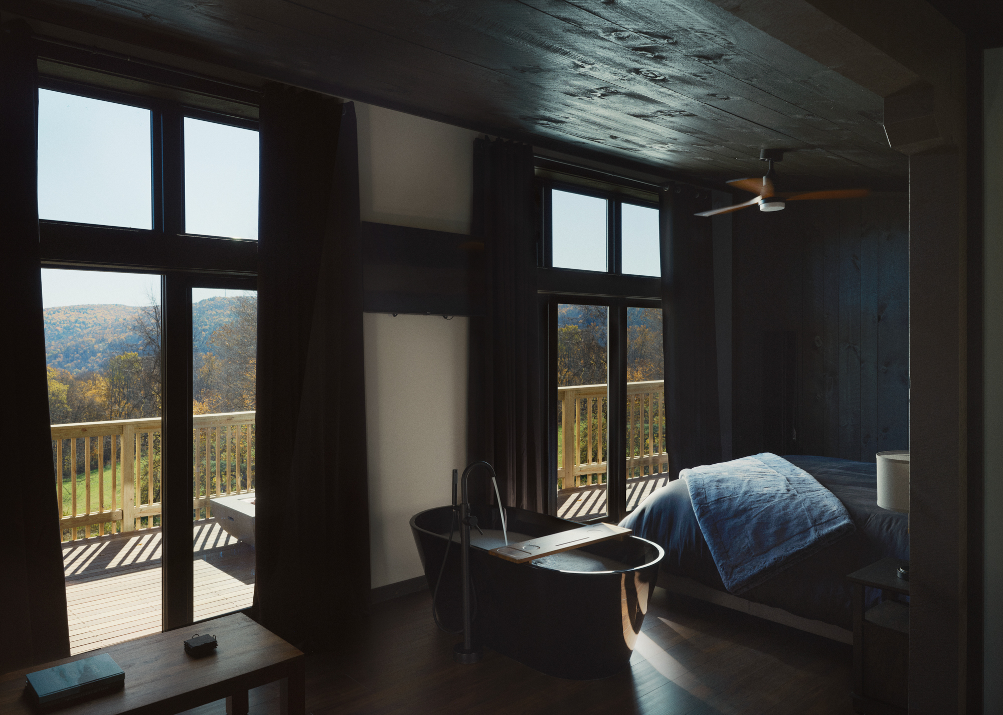
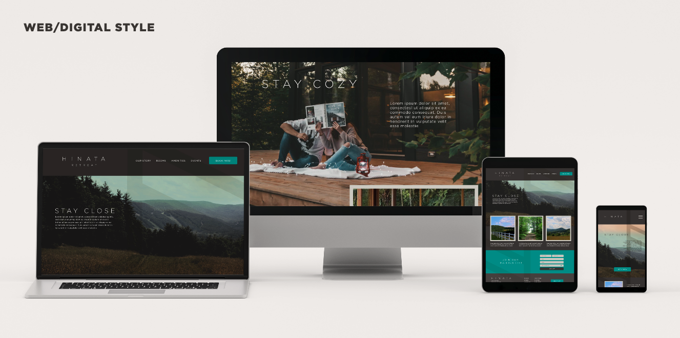
A full brand identity system for a resort, rolled out across print, signage, and digital — built to live inside the architecture.
/// CHALLENGE
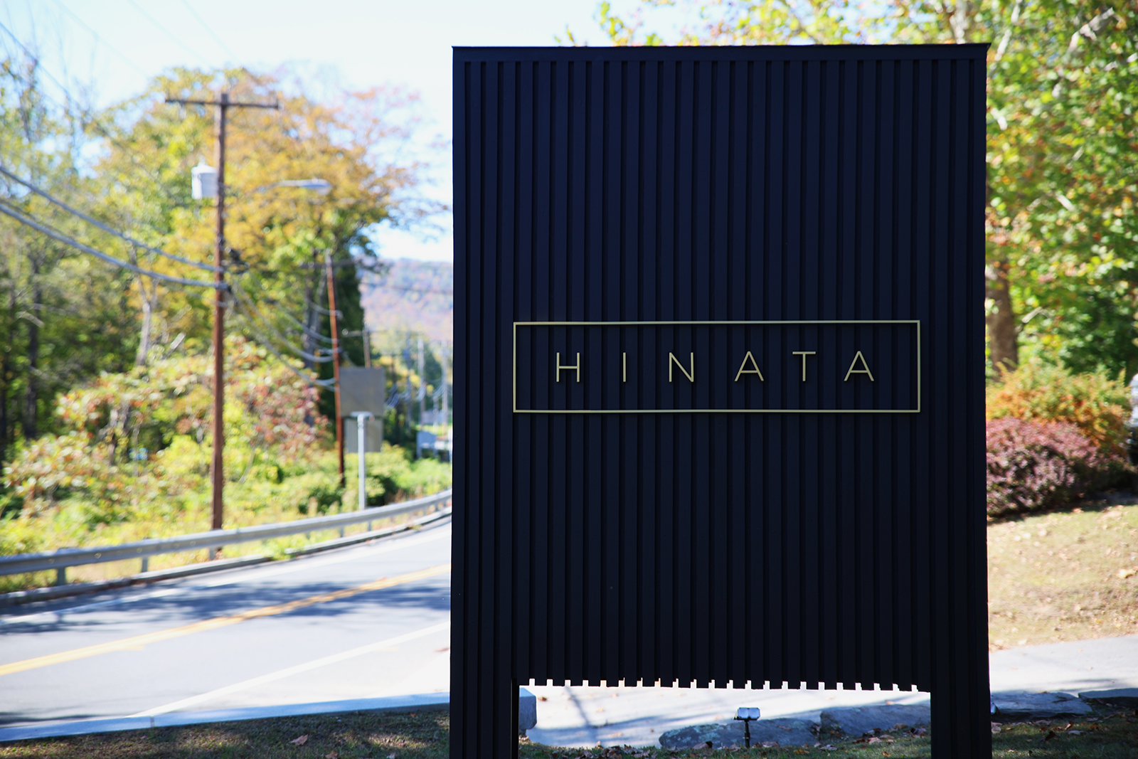
The resort's brand had to feel place-native rather than applied — a system that could survive translation from screen to etched signage to linen without losing intent.
/// SOLUTION
Built a modular identity around a restrained mark and a flexible type system, with application rules tuned to architectural materials. The system scales from a 12px favicon to a 40-foot entry wall without compromise.
/// GALLERY — 7 FRAMES
USE ← → OR CLICK A FRAME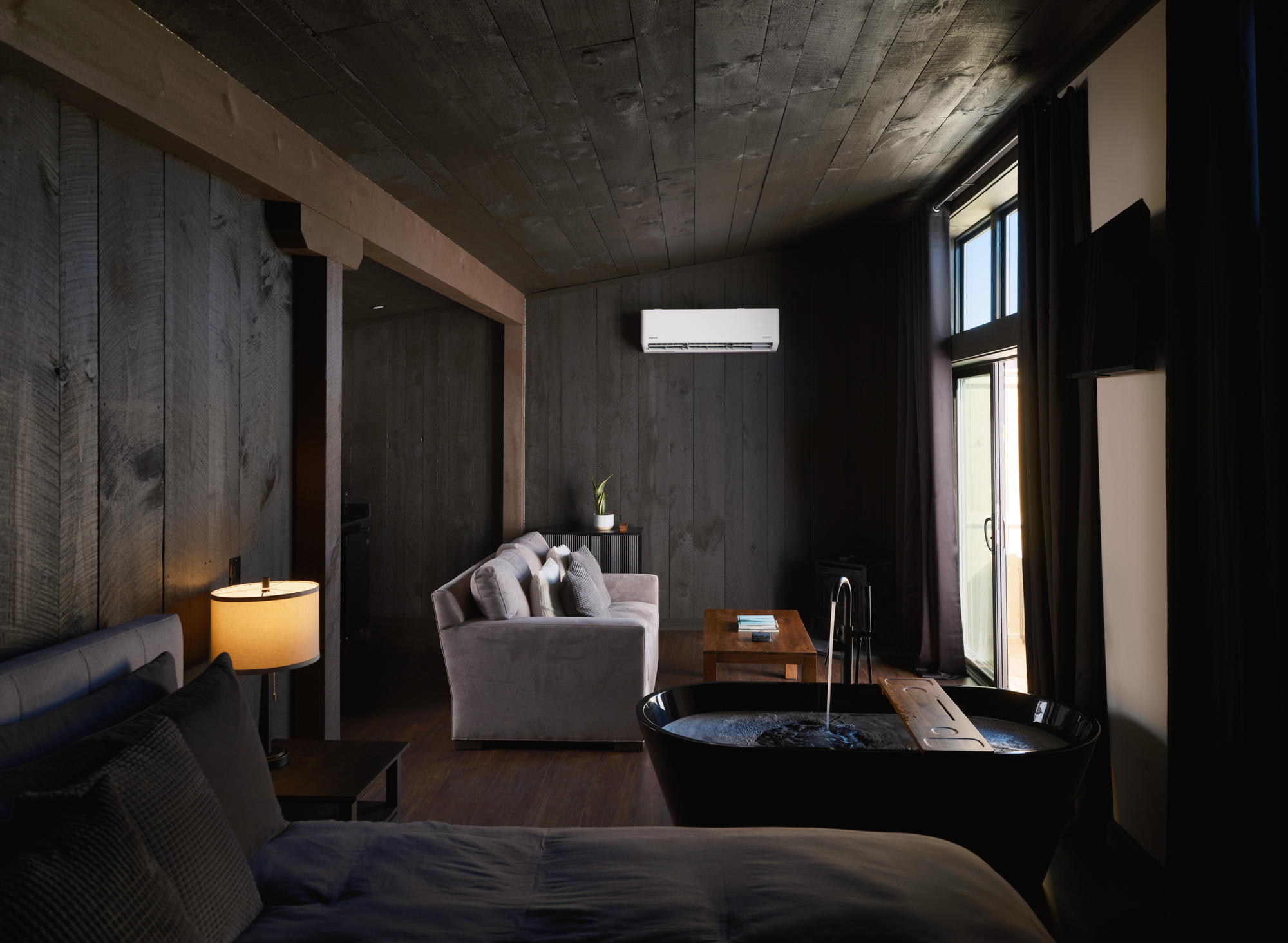

01 / 07