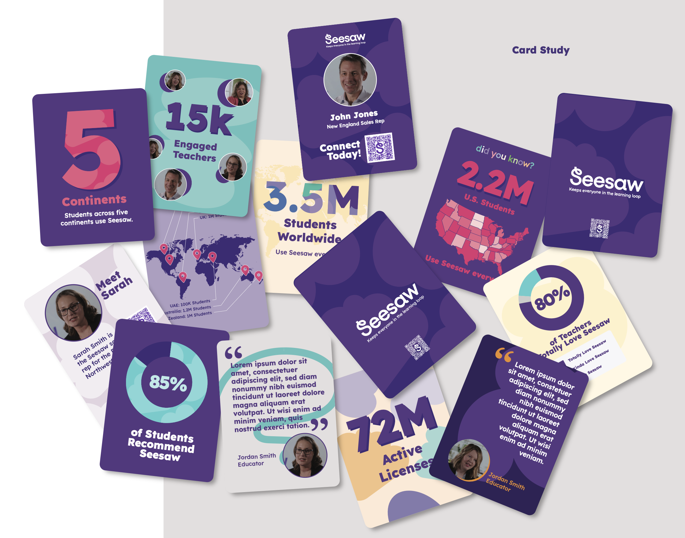
/// CASE STUDY — BRAND IDENTITY
Seesaw
Year2023
ClientSeesaw (Technology)
Location—
RoleBrand Identity
CategoryBrand Identity
DISCIPLINES
- + Brand Identity
- + Visual Identity
- View on thomlong.com
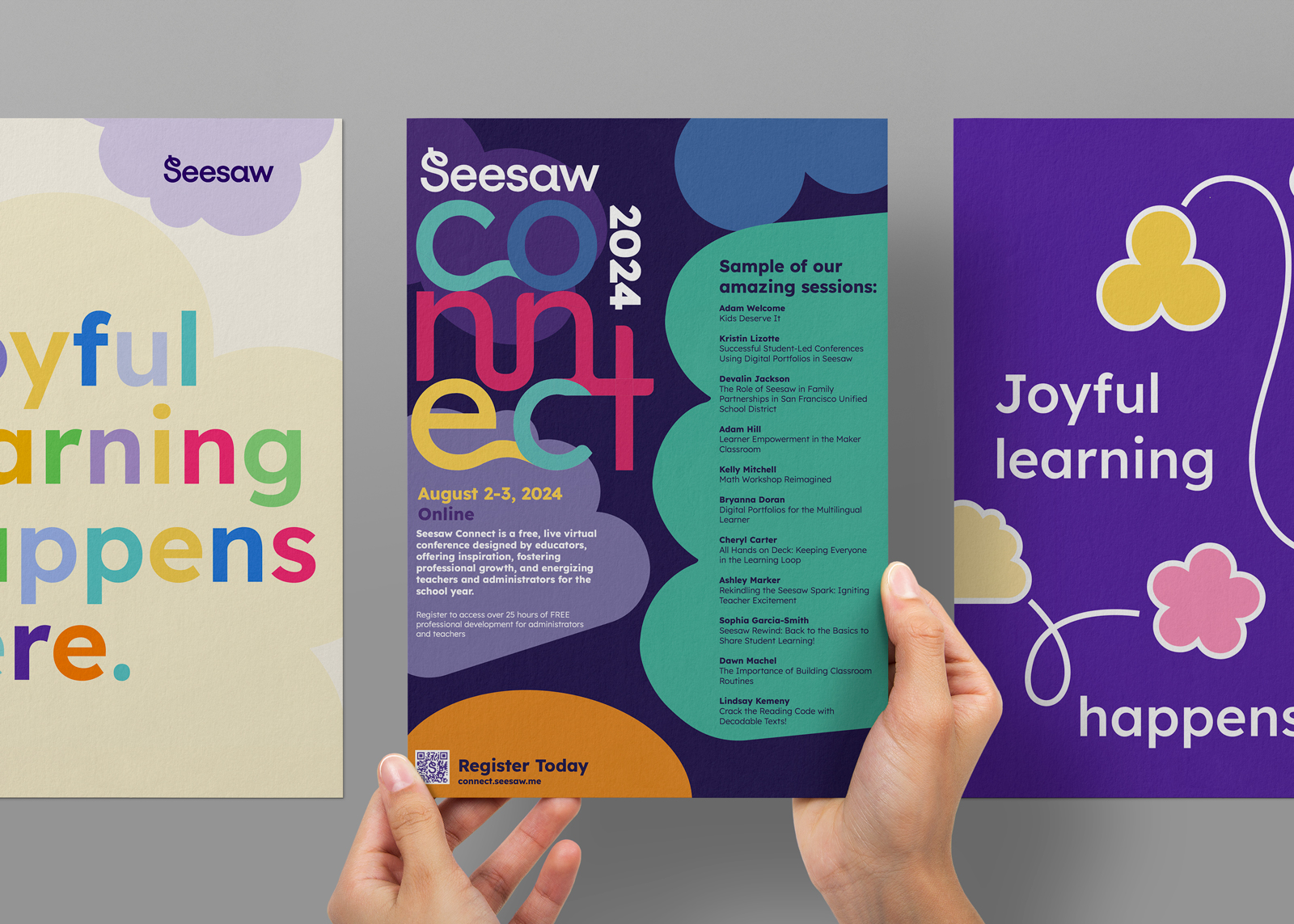
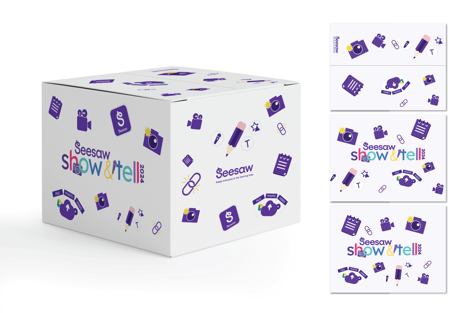
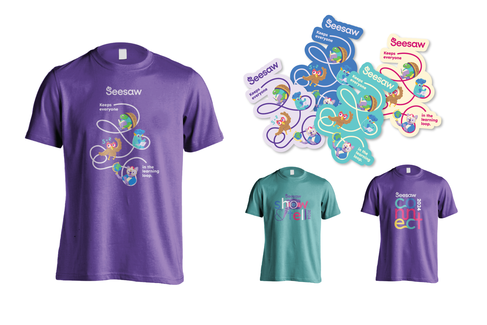
A visual identity for a technology company built around a single balancing concept — flexible across product, marketing, and motion.
/// CHALLENGE
A new technology venture needed an identity that conveyed balance and partnership without resorting to the generic visual language of its category.
/// SOLUTION
Developed an identity around the seesaw's principle of reciprocal balance, expressed through a restrained mark and a motion system that animates the concept rather than decorating it.
/// GALLERY — 7 FRAMES
USE ← → OR CLICK A FRAME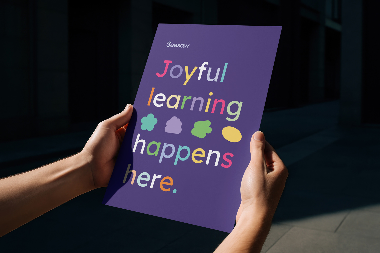



01 / 07